
We rebranded Hydrant, transitioning it from a Brooklyn-based product to a standout in the crowded hydration market. Our approach was to create an honest, believable voice, focused on the concept of enhancing water's effectiveness. The visual design featured a color-rich universe with science-inspired dot columns, reflecting the product's molecular nature. The packaging, with its soft colors, subtly hinted at the mildly fruit-flavored powder. This new brand identity and packaging redesign elevated Hydrant beyond its local origins, carving out a unique niche in a saturated market and attracting customers across social and digital platforms. This transformation has been a key driver in Hydrant's growing success.
Services
Industry


View All

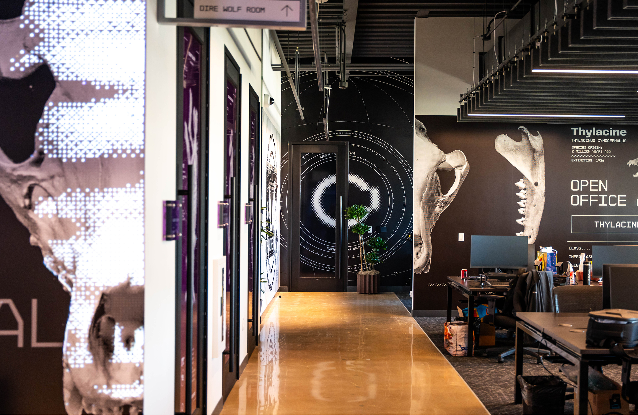
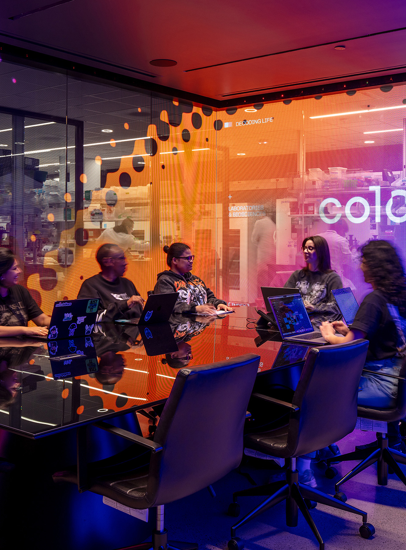
Colossal HQ


No items found.
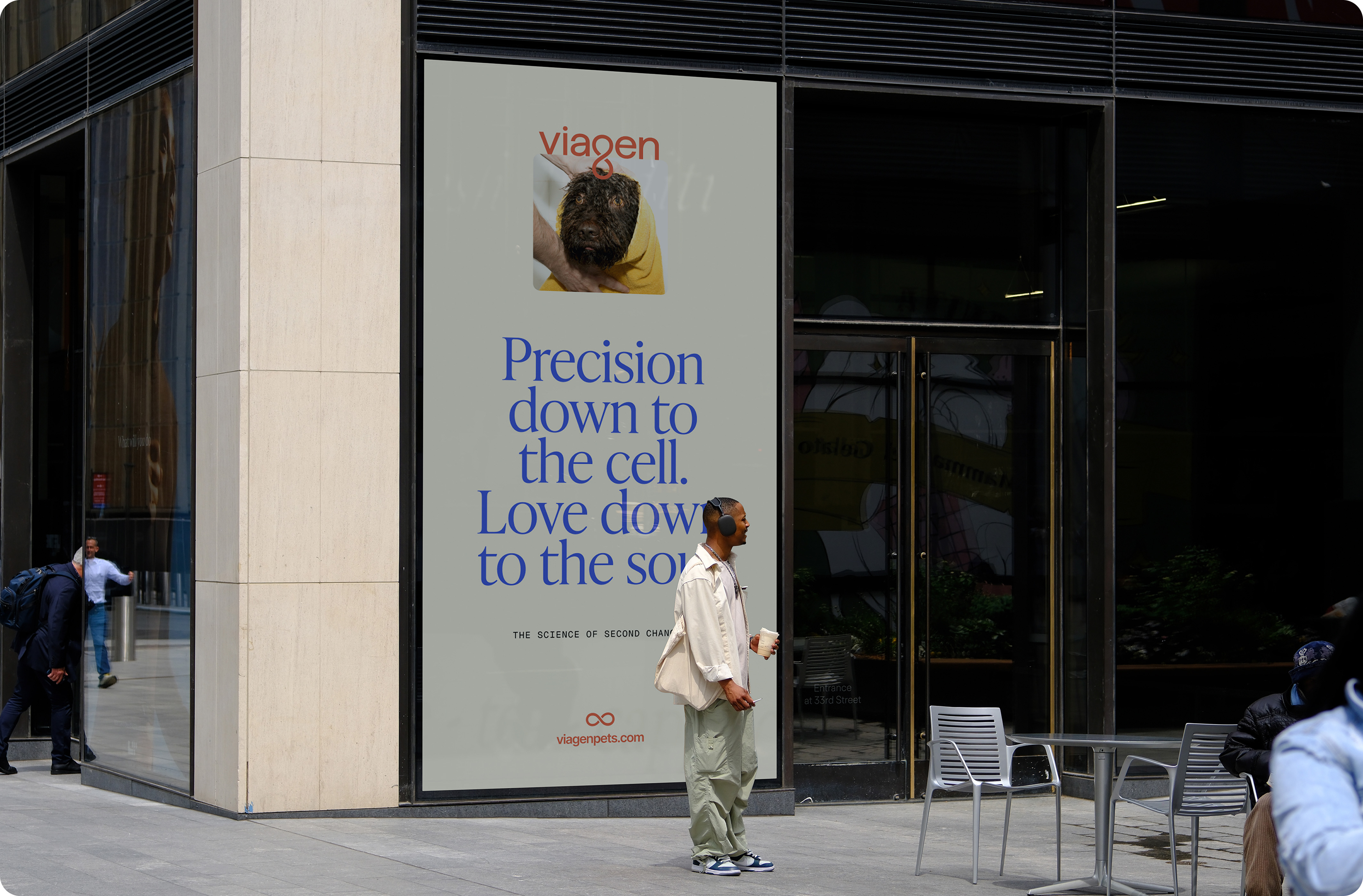
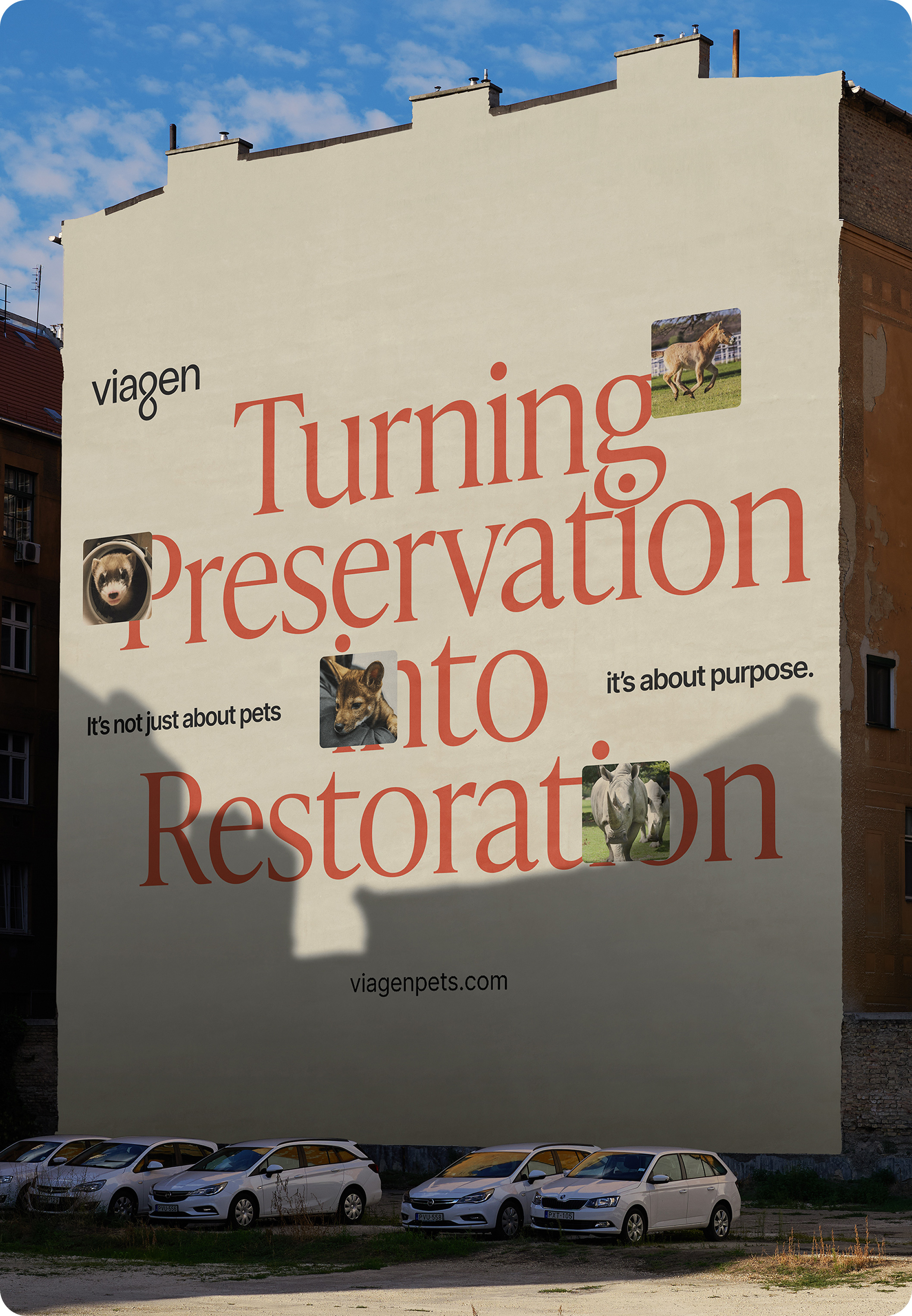
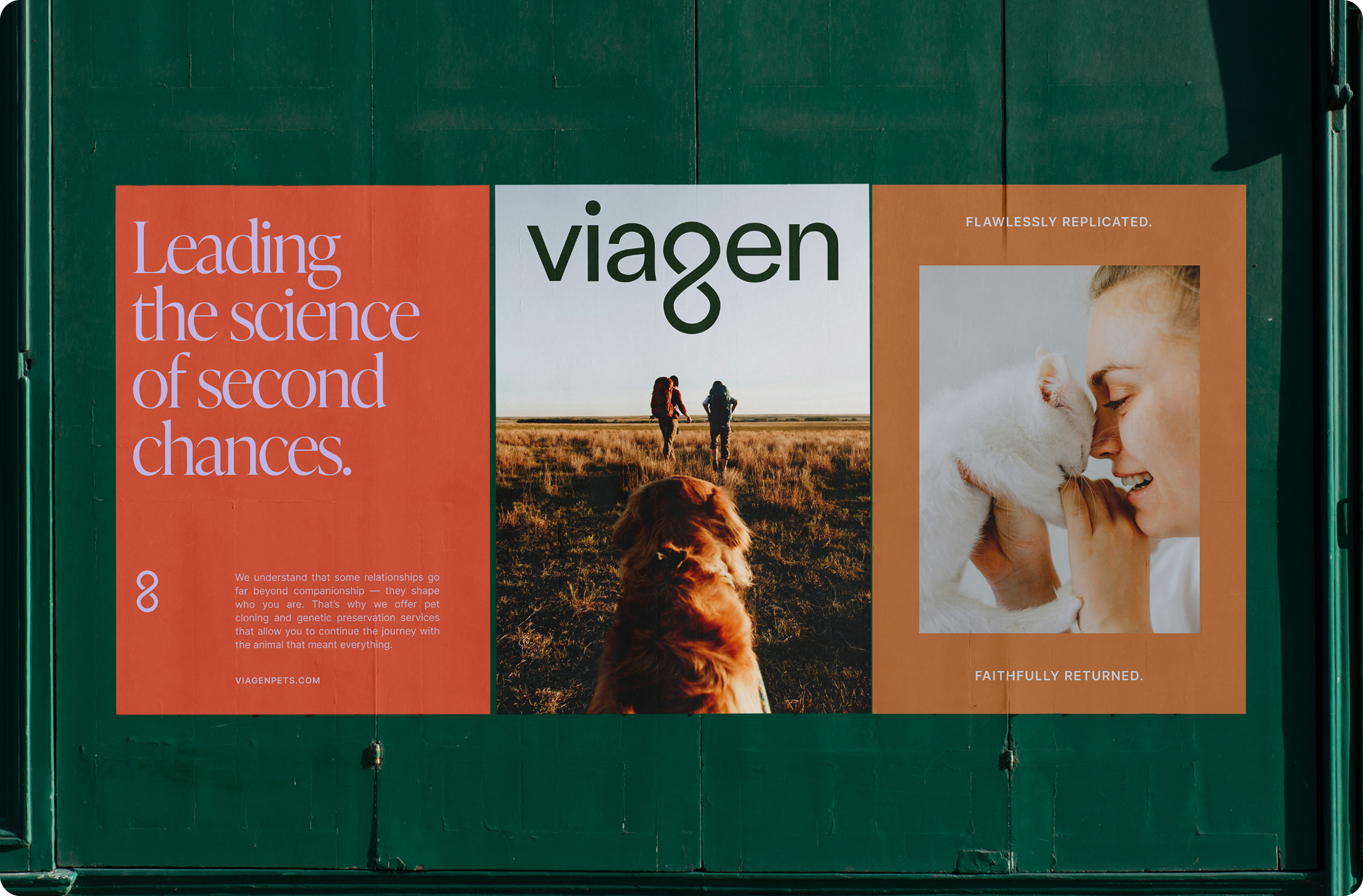
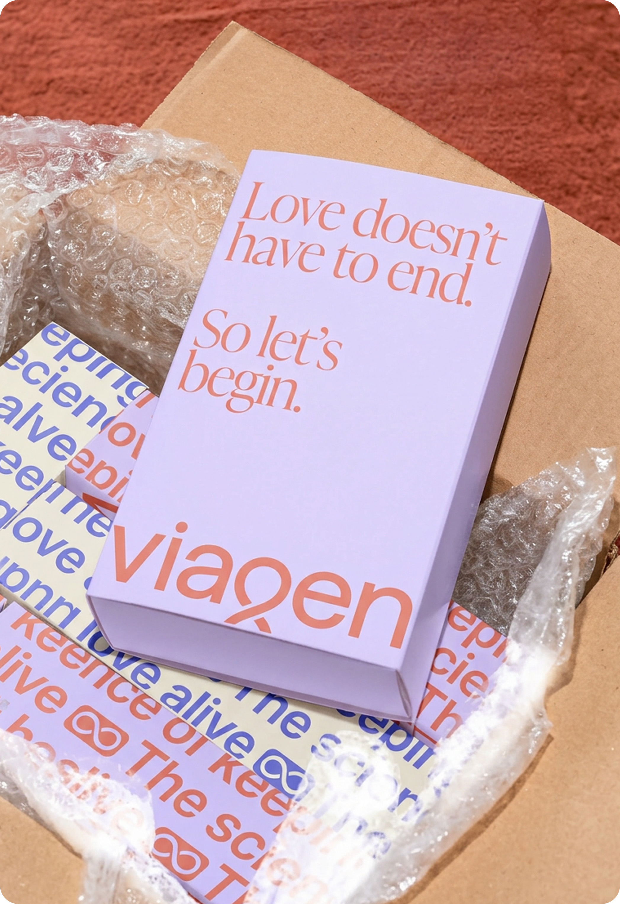
Viagen
No items found.
Breaking


No items found.
Cirque Du Soleil Mad Apple


No items found.
Let’s create something amazing together.
Get in touch